
Responsive Web Design
The term “Responsive Web Design” was first used by Ethan Marcotte in a landmark article for the industry publication, A List Apart. In 2010, Marcotte was advocating we embrace that “the web doesn’t have the same constraints [as print design], and design for this flexibility.” This idea of flexibility came to be known as Responsive Web Design. It took some time for the ideas to set in, but by 2012 “Responsive Web Design” was becoming the industry’s jargon of choice, and Mashable proclaimed 2013 to be “The Year of Responsive Web Design.” The word was invading meetings and water cooler discussions in every office…but what exactly is it?
In the beginning of the Internet, there were desktops and laptops. Life for a web developer had its challenges. However, when it came to the screen size of your user, a lot of very safe assumptions could be made. All websites could be designed for monitors with the dimensions 640 x 480 and later 1024 x 768. Everyone was viewing websites on their computer until smartphones hit the scene in 2007, exploding in 2008, and followed shortly after by the iPad in 2010. The Internet was no longer confined to a home or work computer; it was mobile; it was literally EVERYWHERE.
Websites slowly started offering versions optimized for small smartphone screens. This was typically an entirely separate website with a subset of the content on the “real” site. The assumption was that a mobile device user was “on the go” and needed only the most pertinent information- an address or a phone number, maybe a coupon. The general assumption was that the small screens shouldn’t have contextual information or unnecessary visuals. If a user was wanting to absorb in-depth content on a website, they would only do so while seated at a computer. After all, that’s the behavior we had been seeing for years.
We were wrong.
- Mobile users are not always “on the go”; frequently they are sitting on their couch.
- There is no guarantee that a mobile user will ever view your site on a desktop or laptop.
- If information is important it needs to be viewable on a mobile device, not just a full-size screen. If it’s not important, then why are you sharing it at all?

This diagram shows the increasing number of common screen resolutions. Image credit: teolida.com
So now what?
If our goal is to give the same experience and the same content to all users, no matter their screen size, what can we do? It is unreasonable to design for every specific screen size. We simply can’t keep up. The number of new screen sizes continues to grow as new devices are released. The answer lies in making one design that works for all users; a design that responds to the users needs. This is the birth of Responsive Web Design.
If a site is responsive, the content stays the same but the layout is flexible to best fit the screen size viewing it, or viewport.
Consider the example below:
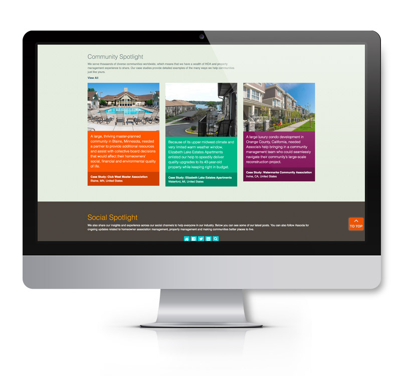
On the widest desktop monitor, the Community Spotlight section of this website has three content blocks displayed side-by-side with an image above the text.
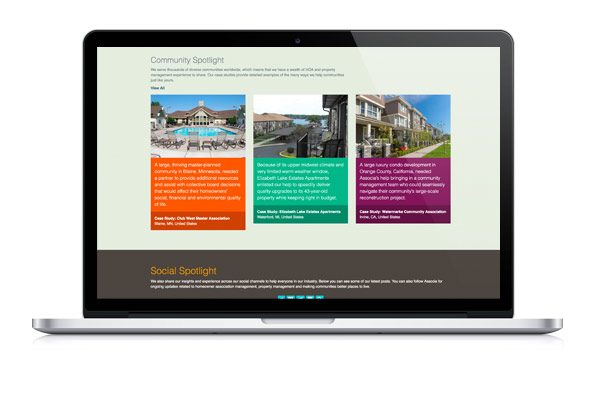
The laptop view has a similar width, but has considerably less height. The Community Spotlight section still displays in a layout like what is seen on the widescreen monitor, but with less extra space along the sides.
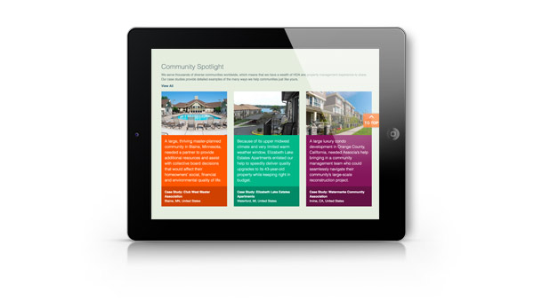
If the tablet is used in a landscape orientation, the content blocks are still arranged side by side. However, this time the columns are narrower. As a results the images are a little bit smaller. The width of the paragraphs is also reduced, resulting in longer length. The content stays the same, but the layout acts fluidly.
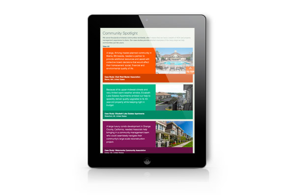
If the tablet is used in a portrait orientation, the layout changes dramatically! Now the content blocks take the full width of the screen and are stacked vertically. The text has moved up and the image is next to it on the right. This new layout preserves all the content, but maximizes the screen space and preserves the site readability.
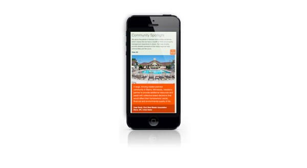
On a smartphone, users are most accustomed to vertical scrolling. In this instance, the best way to utilize the space is to display the content in a single column with images stacked above the respective text.
Looking Forward
The web industry continues to evolve in technical capabilities, consumer devices, and our understanding of user habits. While the technical details of responsive web design may change over time we believe the philosophy, delivering your content to the user wherever they are– and in a beautiful manner, will persist over time.