Just My Type: Using Web Fonts to Improve Your Design
Type plays an important role, regardless of the medium, and can make or break any design. The exceptional use of typography can make a good design into an excellent design. Is your font choice visually appealing, working with the rest of the design elements, or does it feel unpolished, foreign, or out of place?
Readability of your font selection and font sizing both play essential roles. Can your website visitor read and connect with your content? Does your headline take up half of the page? How does the font hold up across multiple viewports of varying sizes, from desktop and tablet to phone and apps?
The Evolution of Web Fonts
In the early days of the Internet, websites were limited to system fonts, such as Georgia, Verdana, and Arial. These fonts were used widely because they were the only options available, but this left no uniqueness and many sites looked far too similar. Developers and designers found workarounds, such as sIFR—a method of using Flash and javascript to display the text—or often saving text as images. These options are no longer considered appropriate solutions because they hinder accessibility and make search engines unable to parse the information on your site. And, with the addition of retina display, once beautifully designed website textual graphics may now look pixelated until these graphics are recreated at a higher pixel resolution.
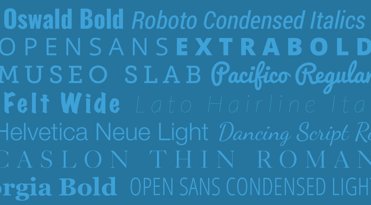
The Abundance of Web Fonts
As the Internet evolved, so did the options for using fonts on the web, from subscription-based services to embedding fonts within a website. One example is Adobe Typekit, a font service that has developed a subscription-based hosting and licensing for a multitude of beautiful web fonts. Some companies, like Google and Font Squirrel, offer hundreds of web fonts for free usage.
Giving your brand its own unique look is much easier now with your choice of charming scripts, casual handwritten styles, and a multitude of others, in light, semi-bold, bold, and heavy font weights!
Too much of a good thing?
It’s important to keep your overarching goals in mind when choosing web fonts and to know the pros and cons associated with this decision. Each web font increases the time needed to load a page and too many web fonts can unnecessarily burden your visitors. Depending on your page content, you may need to compromise. For a text-only page, having more web fonts may be the right decision; however, for a page that has large imagery or other media, the lag in response from downloading additional fonts may be very noticeable and those few precious seconds can make the difference in visitor conversion or bailing on your website.
Our Recommendation
Enjoy a custom website design experience afforded by beautiful fonts and take precautions to positively affect website performance and improve the visitor experience with your Brand.